Modernisation of the look and the websites, a good user experience and easier maintainability on the customer side.
Result
The result is a modernisation of the corporate identity and a relaunch of both websites with new components and a new visual design.
What does the Karlsruhe TechnologyRegion do?
The TechnologieRegion Karlsruhe (TRK) is an organisation dedicated to promoting innovation, science and business in the Karlsruhe region. The TRK is therefore a reliable partner for companies, investors and institutions in the region. It offers comprehensive support from setting up a business to finding a location, arranges network partners and answers business and administrative questions. Thanks to its many years of experience and direct connections, the TRK is a key local authority.
The associated TRK WelcomeCentre supports the search for foreign skilled workers and their integration. Funded by the Ministry of Economic Affairs, Labour and Tourism, it offers comprehensive advice on residence permits, dealing with authorities, the recognition of international qualifications and much more. As an interface and guide, the Welcome Centre is closely networked with regional service centres and companies.
Requirements of the relaunch
The first part of the relaunch was to standardise the visual appearance and modernise the look. The user experience of the old pages was also to be optimised. The aim was to create modern yet simple components based on an optimised page structure that would later ensure a good workflow on the customer side. Both the design and the technical implementation were carried out on the basis of level AA for accessibility in accordance with the WCAG 2.1 guidelines.
Concept and design
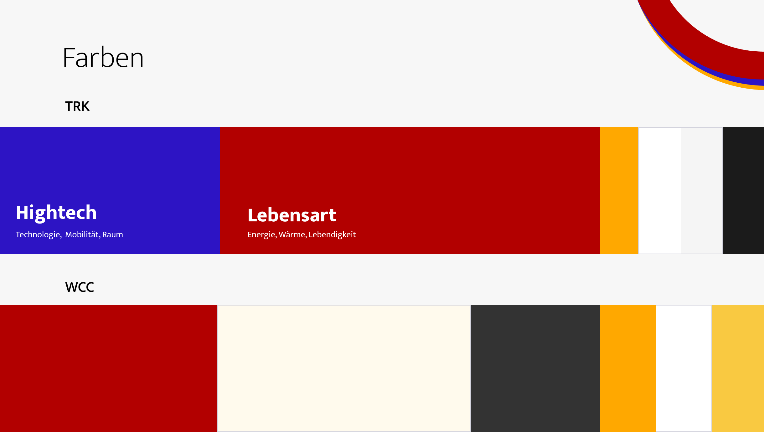
As a basis for further development, we sat down with the customer for a design workshop to discuss the requirements, wishes, objectives and possibilities. Together we looked at the current logos and websites and defined the pain points and difficulties with regard to the design. Another part of the workshop was the status quo and possible optimisations of the colour and font world as well as ultimately the visual revision of the websites.
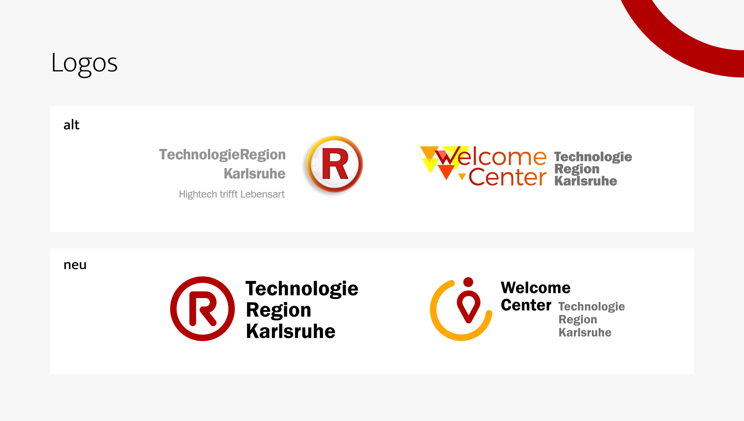
The revision of the visual design began with the corporateidentity. The aim was to revise the colour scheme with regard to modernisation and accessibility. The colours had to match the content of the TechnologieRegion Karlsruhe and the Welcome Center, create a uniform appearance, but also give the two brands their individuality. In addition, the new logo had to remain recognisable from the old brand.
Starting with a standardised font and a uniform shape (circle), each logo has been given its own individual character. The colours red and yellow serve as the basis for both brands – the TRK was given an even more technological character with blue.
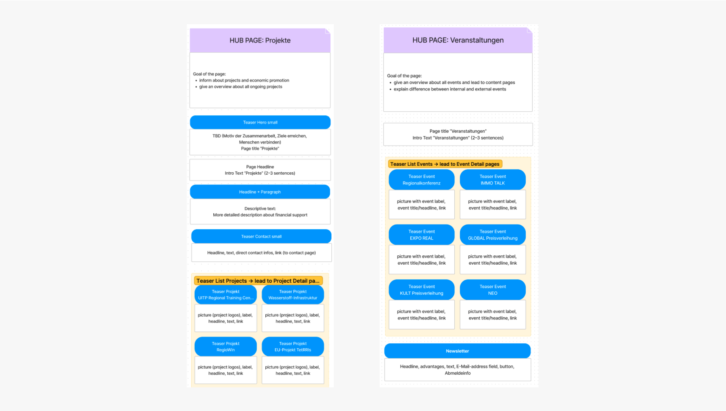
In the concept, we used priority guides to develop the page types and defined components and their requirements. More complex components were developed as functional wireframes.
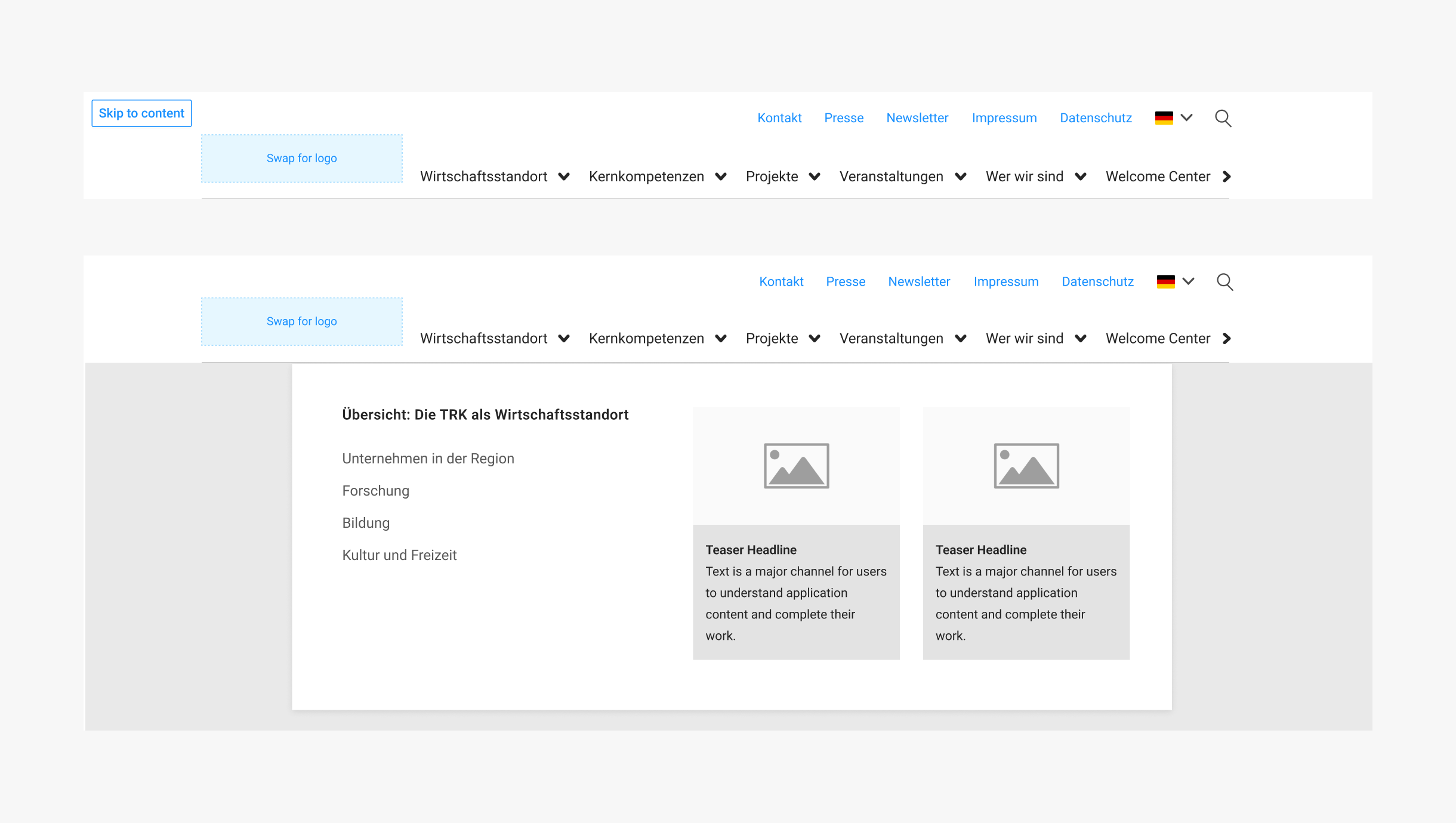
In visualdesign, we implemented the components based on the concept, transferred the new colour schemes to the two pages and created the new imagery. The result is two modern sites that belong together but can still stand on their own.
The development of the digital economy has created countless new channels for communication. What started out as an additional marketing tool has become an important area of investment. This is where our digital game plan comes in.
The development of the digital economy has created countless new channels for communication. What started out as an additional marketing tool has become an important area of investment. This is where our digital game plan comes in.