Badische Neueste Nachrichten is a publishing house distributing news of the Karlsruhe, Baden, Kraichgau, and Pforzheim regions. For 75 years, it’s been supplying people with global and regional news across all media channels and counts 1,700 employees by now.
As a Karlsruhe-based company and long-time followers of German daily newspapers we were excited to accompany BNN into the digital realm and have been working with them since 2015.
What is our connection with BNN?
The goal of our project was not only to digitize their products, but their internal organization and processes as well. As a first step, we built a digital team with members from all departments and developed a simple WordPress-based news website with them. In addition to managing and maintaining the news website, the team also took care of the newly created social channels.
Together as a team we developed formats for the channels, processes, and organizational structures as well as the necessary platforms and tools. Editor after editor was trained to transfer the necessary skills and abilities to colleagues, and we created internal structures to scale the digital output.
The marketing and sales departments also got a digital update. We launched campaigns and communication measures and further expanded the online services for subscribers. We defined digital advertising media for advertisers and then introduced the corresponding sales, production, and reporting processes.
Our projects with BNN
Bit by bit we transferred our responsibilities to the BNN employees, and they have been managing their digital measures by themselves ever since.
In a joint venture with other agencies, we created BNN’s new comprehensive news portal in 2020. Our work on this project is ongoing and includes UX and design, SEO, and web development. Since 2021, the online subscription service BNN+ has also been part of BNN’s digital portfolio.
To this day, we support the departments in close sparring. We assess how the products progress and how the measures perform to ensure continuous further development.
Start your project now
Bring new ideas to life, evolve what already exists, or rethink your structures: we support you as a strategic partner and hands-on implementer.
We’ve been supporting BNN with their digital strategy for 5 years now. The goal of our latest project was to design and implement both a news and service portal with interactive components according to the standards of modern digital journalism. The portals were intended to offer a smooth transition for users without having to switch sites.
UX design: consulting and optimization of the portals
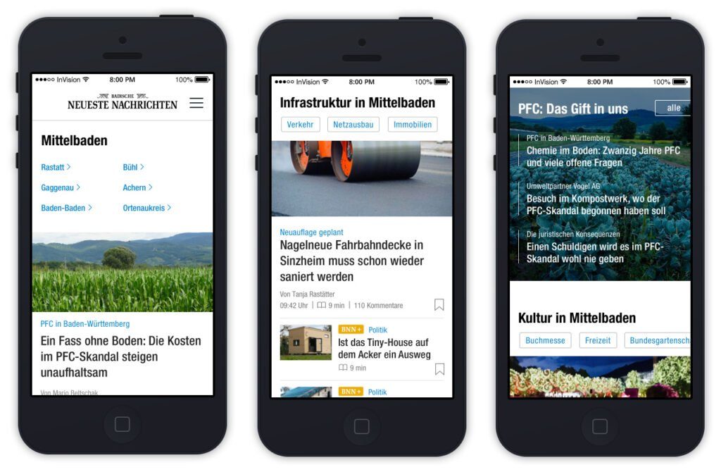
Our first step was to look at the portals and their processes and designs from a user’s perspective. We then implemented these ideas at different points. We designed and tested the visuals on the smallest current device sizes with 320px viewport breadth to ensure that all elements and texts would perform smoothly on every device. The portals have different demands and offer different functions.
We designed and tested for the smallest currently relevant device sizes with a viewport width of 320px.
New structure and optimized design for the service portal
The service portal is where users can subscribe and make requests (like pausing their subscription during the holidays) and the publisher can accept commissions for advertisements and post job listings. We built the portal in WordPress to ensure it would fulfill all these demands. At the same time, we restructured the service portal, added new functions and designed it to match the news portal. The service portal also pays into the premium experience for readers, as all functions can be easily managed here.
Adaptable and reusable content elements for the news portal
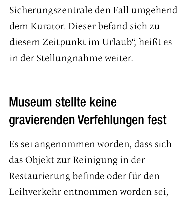
The news portal uses the CUE editorial system. Part of the redesign was to create a smooth user experience. For this purpose, we developed a modern news portal concept that includes a wide variety of content types and formats. The varied content is intended to provide the user with a pleasant reading experience and at the same time attract traffic to the site. In addition to regular articles, the news portal supports other formats that we developed in WordPress for this project:
Interviews
Listicles
News
Columns
Photo series
Cooperation formats (partners can use the reach of BNN and incorporate their content in the appropriate format).
A separate longread template for more extensive articles and in-depth reports
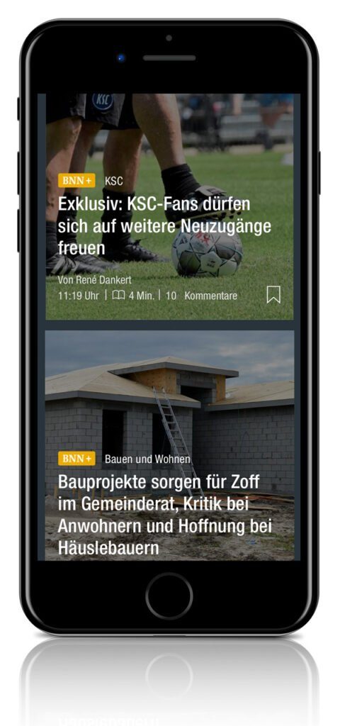
On category pages and landingpages, the different formats are marked accordingly: premium content is marked with a BNN+ badge, picture galleries have their own icon, and articles that contain videos have a video icon. Additionally, authors can introduce themselves with a list of all their articles.
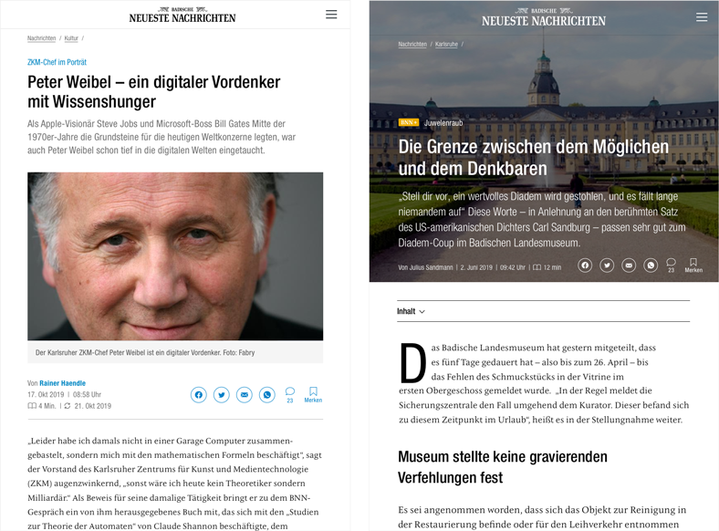
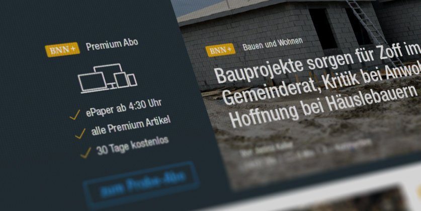
Marking premium articles with the BNN+ badge in the mobile view.
Improved navigation of the news portal
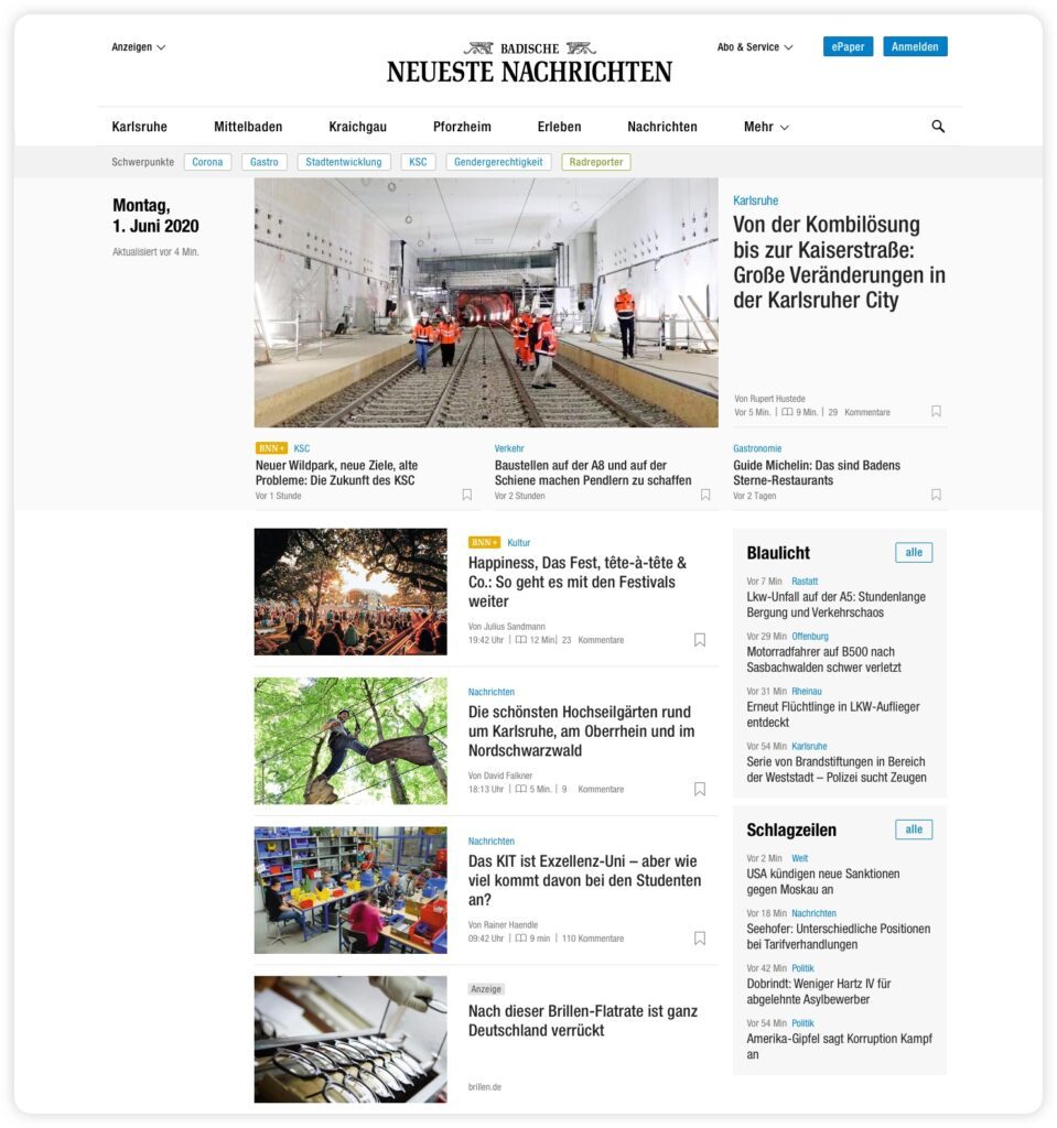
We implemented various measures to improve the user experience and give it more structure. We created landingpages based on geographic regions so that the content can be categorized via region and city. Articles on specific topics can be collected and curated on category pages. These pages can be accessed via, for example, focus topics that are prominently placed in the main navigation and in the burger menu on mobile.
News alerts like a news ticker are used to gain reach. The premium experience for the reader is created by ad-free premium content (marked with BNN+) and other convenient features such as reading time tracking and (in the near future) the ability to save articles for later reading.
New visual design
Consistency of brand and typeface
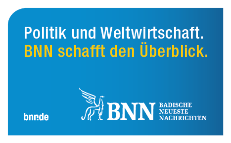
BNN uses Helvetica Condensed for all texts in marketing media. Since news portals contain a lot of text, their typeface must make most efficient use of the available space. We ensured the consistency of brand and typeface with Helevetica Condensed.
Example application of the visual appearance for BNN's marketing media.
Use of Helvetica Condensed on the homepage of the news portal.
For the text body, we chose another typeface that ensures good legibility in longer texts: the revised antiqua classic “ITC NewVeljovic”. Due to its modern serif character the appearance of the revised antiqua classic “ITC NewVeljovic” is timeless and neutral without lacking personality. It thus excellently supports the credibility of the news portal. Ideally, subheadings should be designed in such a way that they serve as visual jumping points. This gives users a quick overview when skimming the article. Therefore, for the subheadings we chose “Helvetica Condensed Medium”. It provides a high contrast to the text body while also staying consistent with the headlines on the category pages.
The fonts are also comfortably readable in combination and fit into the visual design concept.
Tablet view of an article (left) and longread (right)
Highlights with colors and icons
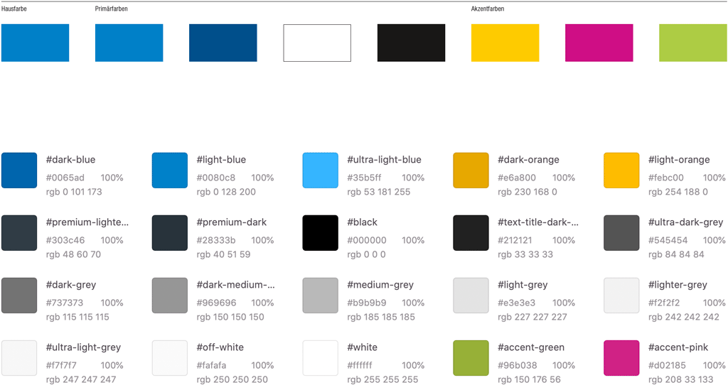
We extended the already existing color palette to create a distinct cut between the newsportal and other marketing publications. The existing shade of blue we retained as an indicator for interactive elements and as a highlight color. For highlights, the color palette was extended by a rich selection of gray shades in order to have sufficient gradation for texts, meta-infos as well as color areas for each application. Orange is now used as an accent color for the BNN+ Premium concept.
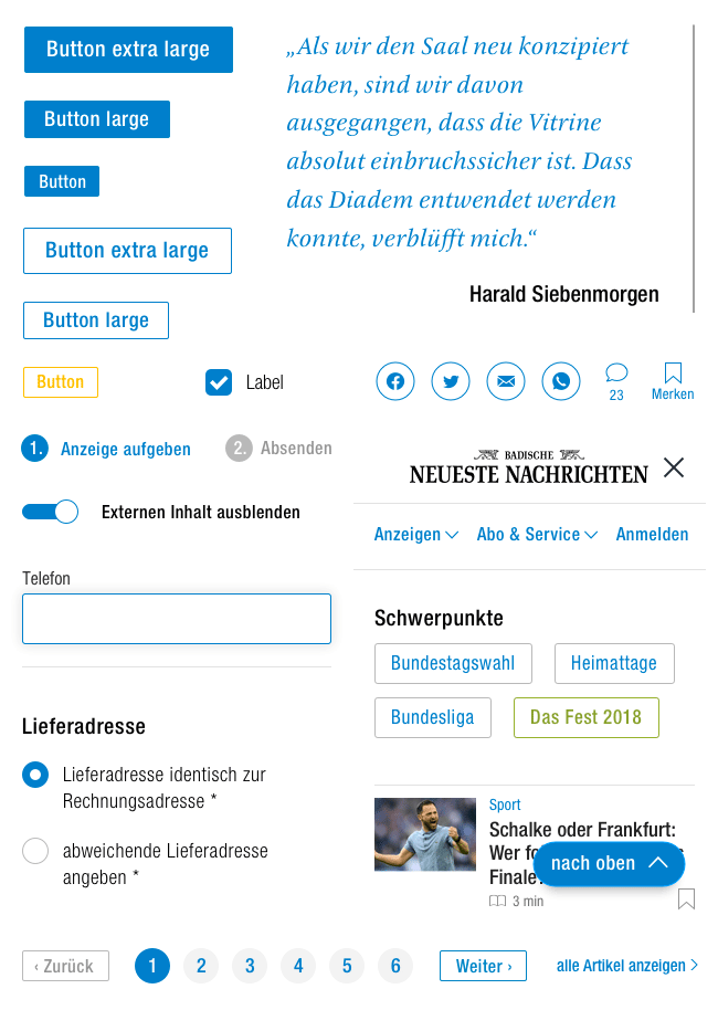
Icons we used in this project.
Furthermore, we developed a range of icons in a uniform design language. This “toolbox” will ensure a consistent content design using clear visual language. See below the icon for premium content (top left) or for articles with videos (third row, far right).
Using the color blue to indicate interactive elements and for highlights.
Above, the color palette of the existing visual appearance. Below, the expanded and adapted palette.
Look and feel of premium content
To make the reading experience of premium content as engaging as possible, we came up with several ways in which the premium articles differ from regular content.
Longread articles and image galleries are kept in a dark look and feel in order to visually distinguish them from other articles at teaser level as well.
Longread templates do not include the advertising space provided in article templates in order not to disturb the users’ reading flow and premium experience.
Longreads have a large image as a fixed element that fills the respective end device’s entire viewport to create an immersive premium experience and clearly differentiate it from non-premium articles. In addition, the Longread template offers more options for breaking up text volumes with custom elements such as more versatile image elements or a chapter navigation to provide an overview over longer articles.
Component recyclability
For this project, we worked with the atomic design method. To optimize communication between the design and development teams, we built a pattern library using the Zeplin tool. This allows everyone involved to quickly and easily access every element, component, and layout without having to have those elements implemented in the test system. This resource has perfectly supported the agile project flow and will continue to be used by our developers and the BNN team to further develop the platforms.
We designed the layouts so that the individual components can be reused. For example, article teasers work in list view, for the “Similar articles” view, and in the article’s text body itself. With the exception of the longread template, each article format and article teaser uses the same template as a base. They are only marked up differently and enhanced with the necessary elements depending on the application, e.g. question-answer formatting for an interview. The pattern library can be used for both the news and service portals.
Conclusion: optimized interplay between user needs and design
For the BNN relaunch, we were able to further develop the previously established visual appearance and adapt it to current user needs. The daily newspaper now perfectly combines its own CI with the modern requirements of a digital newspaper. Users are offered a variety of content without having their reading flow interrupted. Editors can use basic components and practical extensions to create exciting content that gains reach and is pleasantly designed for users. The design language of all components of the news and service portal are consistent within the scope of the respective platforms.
We are very proud of the journey we have been on together so far and look forward to further cooperation with BNN.
«In the words of Rea Garvey, it’s “unfucking fassbar!“, but the new bnn.de is live. 🤩 Thank you, thank you, thank you to all netzstrategen! You’ve all done a great job!!! ❤️.»
Start your project now
Bring new ideas to life, evolve what already exists, or rethink your structures: we support you as a strategic partner and hands-on implementer.
The development of the digital economy has created countless new channels for communication. What started out as an additional marketing tool has become an important area of investment. This is where our digital game plan comes in.
The development of the digital economy has created countless new channels for communication. What started out as an additional marketing tool has become an important area of investment. This is where our digital game plan comes in.