Website Relaunch: Visual Design and Branding
Website Relaunch: Visual Design und Branding
Development of a target group-orientated image to sustainably strengthen the brand perception of B.PRO. To offer customers from the community catering sector a platform for solutions and inspiration for their industry.
A target group-orientated website that is equipped with future-proof technology and offers a solid basis for the seamless integration of further projects.
What does B.PRO GmbH do?
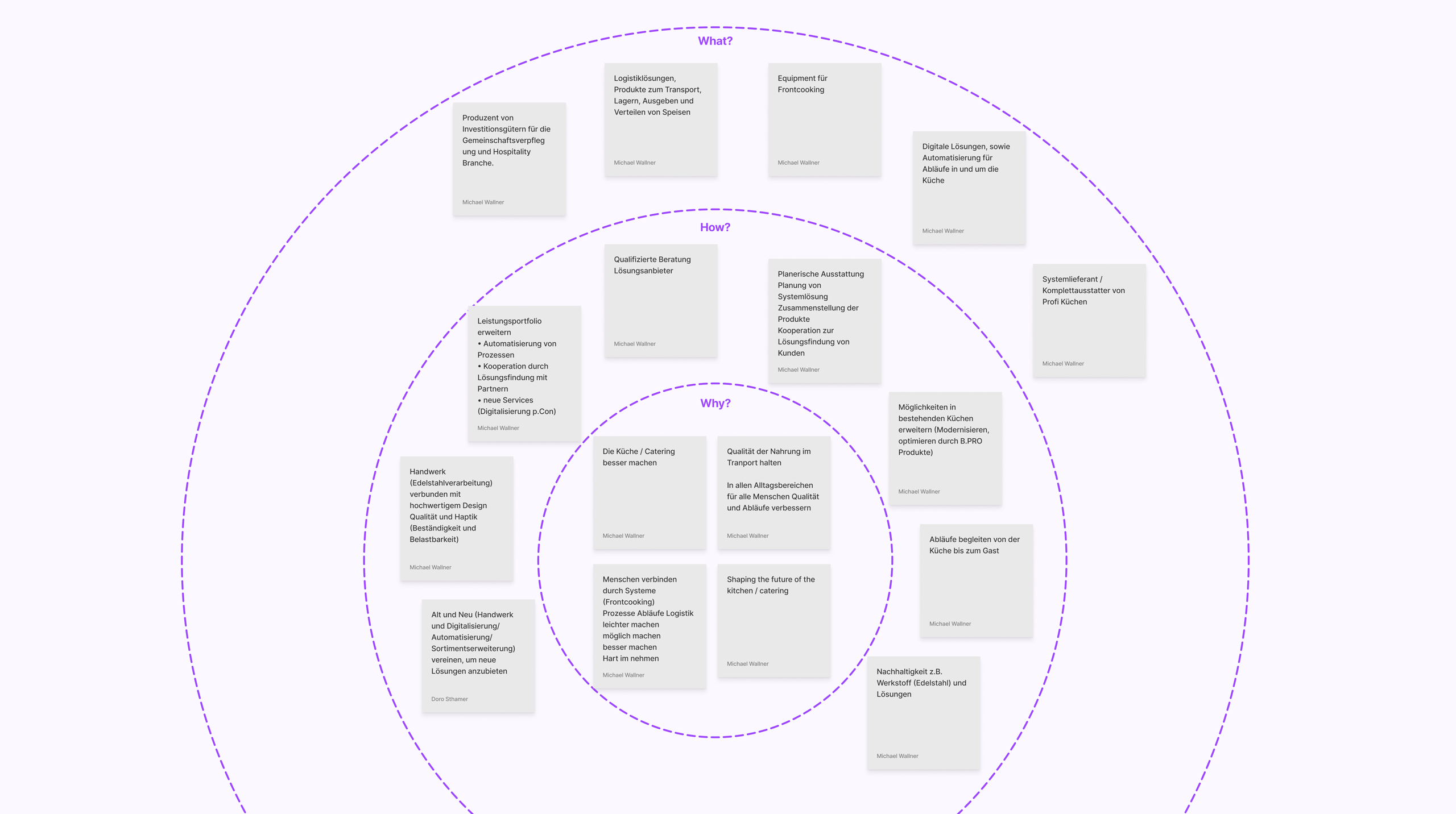
B.PRO GmbH is an international company specialising in the manufacture and sale of capital goods for the mass catering and hospitality industry. Its product portfolio includes innovative solutions for transporting, storing, serving and distributing food as well as equipment for front cooking. B.PRO relies on advanced technologies and integrates digital solutions and automation processes to optimise workflows in and around the kitchen. B.PRO increases the productivity of its customers with efficient, advanced products and guarantees the highest standards of quality and reliability.

Target group-orientated planning and concept development
To create a solid foundation for the website relaunch, we started with a series of workshops focussing on target group analysis and the development of personas. This in-depth analysis allowed us to create a detailed catalogue of requirements and measures that included concept, content and technical specifications. The insights gained served as a perfect transition to the design workshop, in which we worked together to further refine the visual concept of the new website.
Collaborative Visual Design workshop
In an intensive visual design workshop, we focussed on sharpening the brand image by developing a distinctive claim and formulating the mission and vision. A standardised look and feel was also defined. We seamlessly integrated the results from the previous workshops into the visual strategy to create a coherent and appealing user experience.

Definition of the design principles and appearance
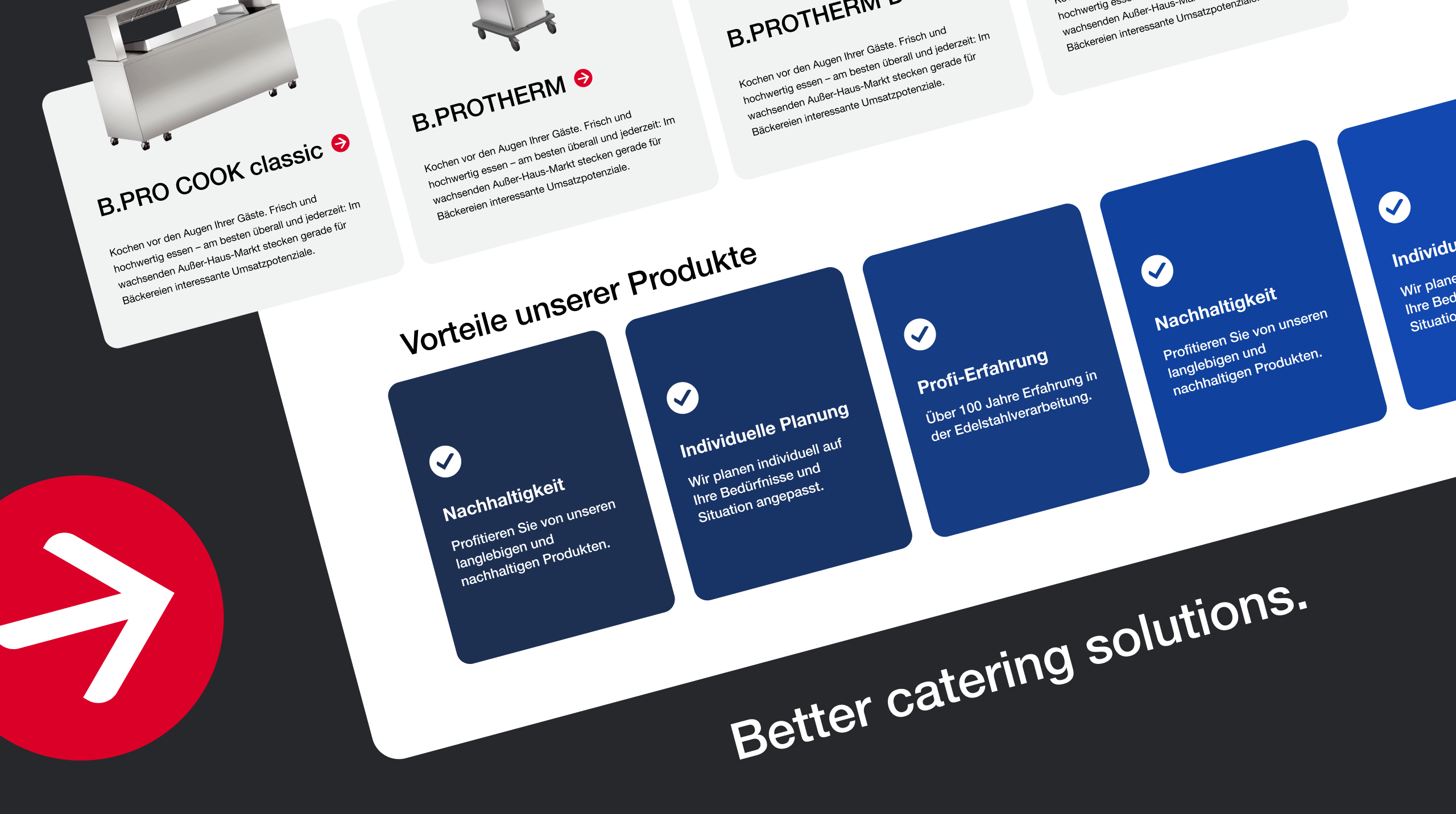
Parallel to finalising the sitemap, we developed the look and feel of the website. Our main goal was to create a trustworthy and modern look and feel that both exudes modernity and reflects B.PRO’s core values. The design was derived from the formal language of the product design, using simple lines and rounded corners found in the schematic illustrations of the product catalogues, the rounded corners of the trays and trolleys and the existing logo. These rounded corners were also incorporated into the iconography. The colour scheme was retained and adapted to reflect the times: Red is now used exclusively for interactive elements, while the grey of the logo has been made more saturated to give it more character. This creates a harmonious contrast between a signal red and an elegant, dark grey with a high proportion of blue, which reflects the stainless steel elements of the B.PRO products. The typography was realised with Helvetica to give the brand a timeless and robust effect.
„Thank you very much for the super elaborated documents, really great result. Thank you for the intensive collaboration, it was a lot of fun.”
Bruno Brandl - Senior Online Marketing Manager at B.PRO GmbH
Conclusion
The comprehensive website relaunch project for B.PRO GmbH was characterised by thorough preparation and customised design approaches. Through targeted workshops and intensive collaboration, we developed a target group-orientated and technologically advanced online appearance that repositions the brand both visually and functionally. The incorporation of the design language from the B.PRO products into the web design ensures a consistent brand experience, while the strategic choice of colours and typography effectively underlines the corporate values. With the redesigned website, B.PRO was able to strengthen its online presence, improve the user experience and create a solid platform for future digital endeavours.
Our projects with B.PRO GmbH


Unsere Projekte für die B.PRO GmbH

