The xLab, associated with Karlsruhe University of Applied Sciences, provides a space for students, researchers, and scientific staff to explore and experiment.
The goal is to raise student awareness about the project and define the necessary strategic measures to achieve this.
Result
A redesigned, contemporary appearance as a design system that serves as a modular kit, enabling flexible website customization.
xLab is an experimental laboratory of the Karlsruhe University of Applied Sciences. xLab offers space for students, researchers, and scientific staff to explore, experiment, and try things out. Removed from the rigid categories of more traditional environments, students can develop and implement their own ideas, projects, research approaches, or results in a protected environment with the support of coaches, guest lecturers, and professors. With these values in mind, we have revised xLab’s corporate design and created a new online presence.
Our process
Our goal was and continues to be to make students aware of the project. We developed and planned the digital strategy with the aim to create a better site structure and user experience. This involved the digital business, SEO, and design and experience disciplines.
Digital Business Workshop
We identified and determined relevant personas using the experience already gained and data available.
SEO and content
As part of our SEO audit, we examined the site’s structure, performance, page content structuring, and onsite and offsite linking. We also took a look at the competitors.
Topic areas and important keywords were defined and prioritized in the joint SEO workshop. We also analyzed the keywords’ respective search volumes and potentials, and defined the sitemap or information architecture.
We set up Google Search Console, and all results and conspicuous features were carefully documented in a presentation, which we subsequently provided to xLab. We directly implemented the quick wins identified in this way.
The sitemap shows the structure and layout of the (future) website.
The redesign
Design and experience workshop
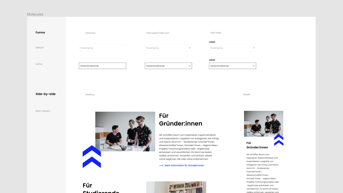
First, we defined user stories for the personas in order to work out the concrete requirements for the website and derive the appropriate measures from them.
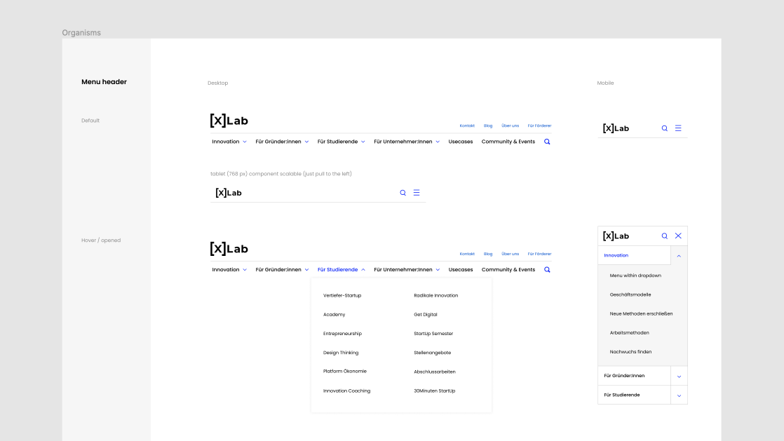
New design: concept and basis
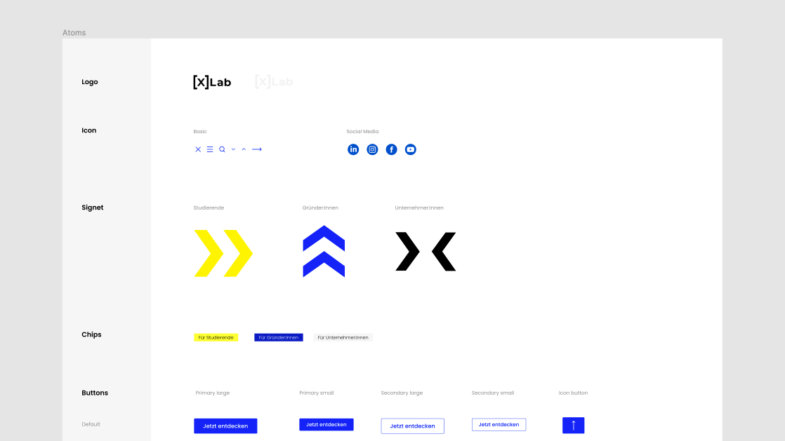
Meaning of the logo
The logo of xLab can be used further as a dynamic design element (see design pattern). The X is now used as a variable parameter. The square brackets [ ] represents a safe and protected space, and “Lab” clarifies xLab’s experimental character.
Branding: color scheme and meaning
The specified basic colors black and white will continue to be used. In a joint design workshop, we added very saturated versions of blue and yellow to the spectrum. The color blue stands for trust, space, intelligence, innovation, and security. Yellow represents freedom, optimism, joie de vivre, creativity, and exploration. In combination, the colors represent an experimental character and at the same time a safe environment, both of which fit very well with xLab’s brand identity. The black-yellow and blue-white combinations are reminiscent of safety signs and color schemes from laboratory environments.
Typography for the new website
To break up this sober safety and warning color scheme, we chose a progressive type design that works beautifully with the Poppins font. This font brings an unconventional component to the website’s appearance thanks to its very strongly geometrically constructed form. Due to its concise graphic character, the font comes more to the fore than more classic fonts, which are usually more restrained. In addition to its high legibility, the typeface has a very well-developed type set.
Design patterns and motion design
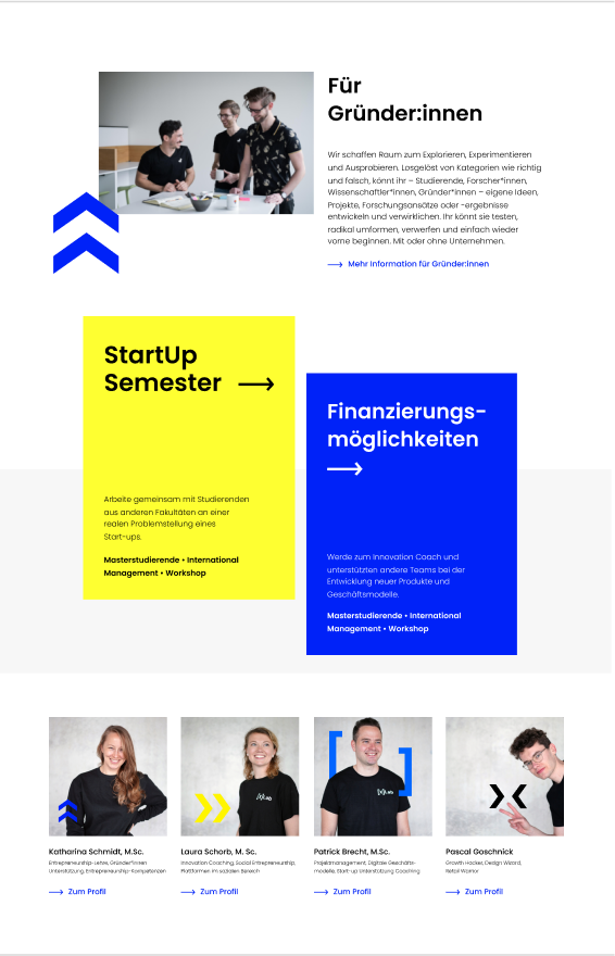
The idea was for the branding to incorporate xLab’s three core competencies or disciplines: knowledge building, networking, and infrastructure. The logo’s signet was supplemented by design elements and transformed into an animated form. This should help users in particular to classify categories and topics on the website. The color scheme is intended to support this systematically: the landing page on the topic of knowledge building is dominated by the color yellow with the corresponding logo.
Design system in Figma
For this project, we used Figma as our design tool. We use Figma for collaborative work because the components are always directly available to everyone in the latest version without an extra synchronization process or manual file swapping. Once the project is completed, this library can also be used and developed by the clients and serves as an archive for the previous versions.
Exemplary personas with their customer journeys from the B2B and B2C sectors.
Implementation of the concept
The site was implemented by xLab itself after we handed over the design concept and components of the design system.
Start your project now
Bring new ideas to life, evolve what already exists, or rethink your structures: we support you as a strategic partner and hands-on implementer.
The development of the digital economy has created countless new channels for communication. What started out as an additional marketing tool has become an important area of investment. This is where our digital game plan comes in.
The development of the digital economy has created countless new channels for communication. What started out as an additional marketing tool has become an important area of investment. This is where our digital game plan comes in.